01
Brief
An Italian table
with its own name.
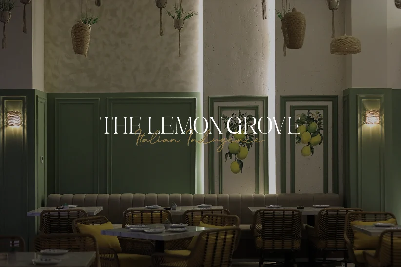
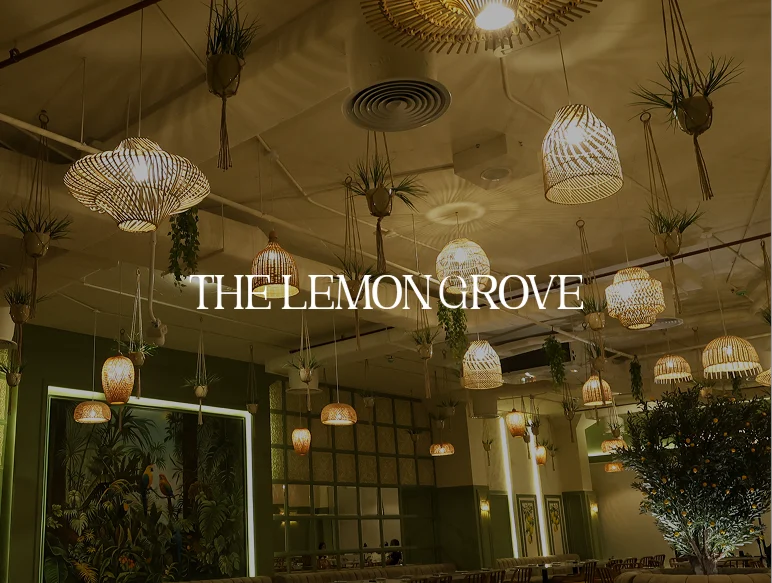
The Lemon Grove is an Italian restaurant built around a lush, green dining room of rattan lanterns, hanging plants and lemon trees. KHP was asked to give it a brand that matched the room: refined enough for an evening out, warm enough to feel like Italy.
02
The Challenge
Premium dining
without the stiffness.
Italian restaurants compete on the same cues: red-and-white checks, script logos and stock pasta shots. The Lemon Grove needed an identity that read as premium at a glance and still felt generous and inviting.
It also had to work everywhere a guest meets it: the sign outside, the card on the table, the envelope that carries a booking and the feed where most diners decide where to eat tonight.
03
Our Approach
A serif, a script,
and the colours of the room.
Step 01 - Wordmark & Signature
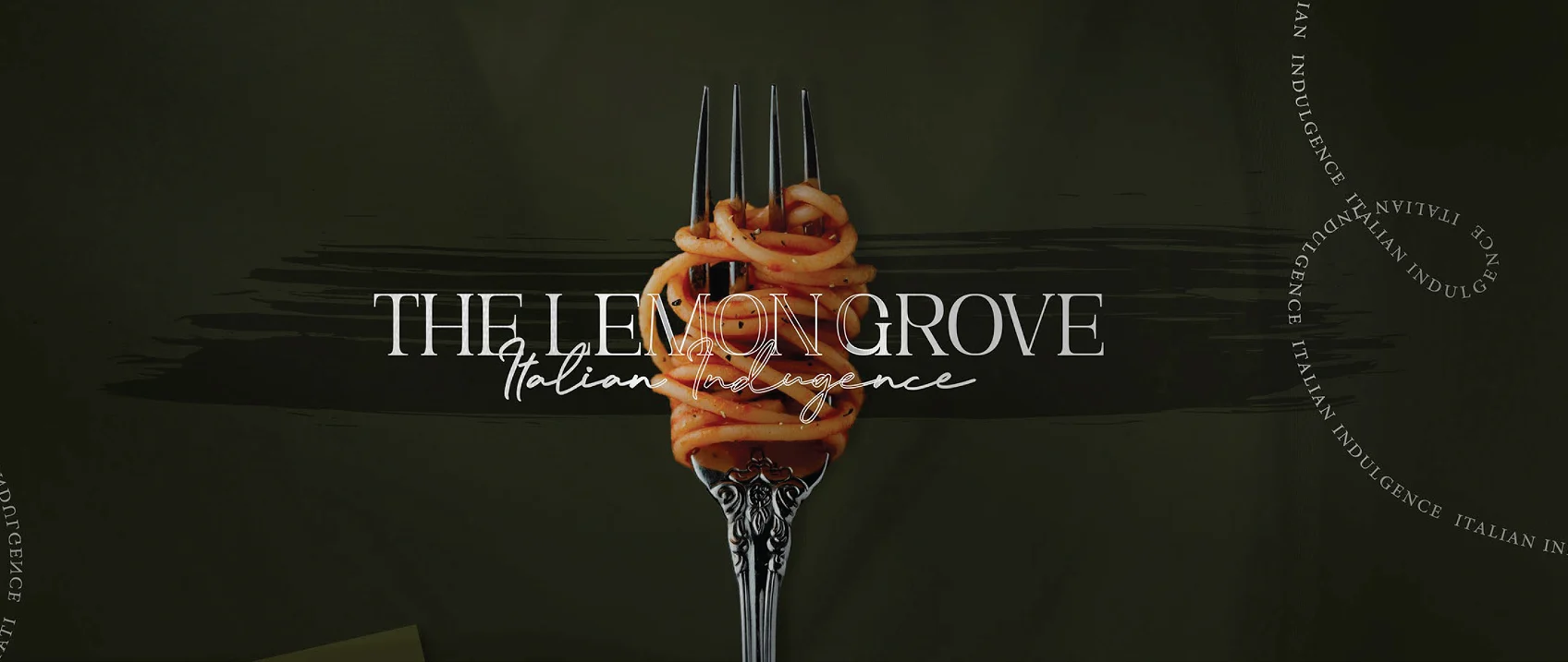
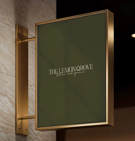
We set THE LEMON GROVE in a tall, high-contrast serif and paired it with a hand-drawn Italian Indulgence script, so the mark carries both the formality of the dining room and the warmth of the kitchen.
Step 02 - Colour Palette
The palette is taken from the restaurant itself: Phthalo Green for the leaves, Sand Yellow for grain and lemon, Sage Green for the herbs, giving every touchpoint the same calm, natural depth.
Step 03 - Applied Identity & Social
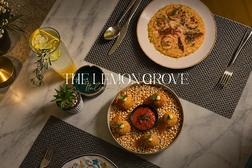
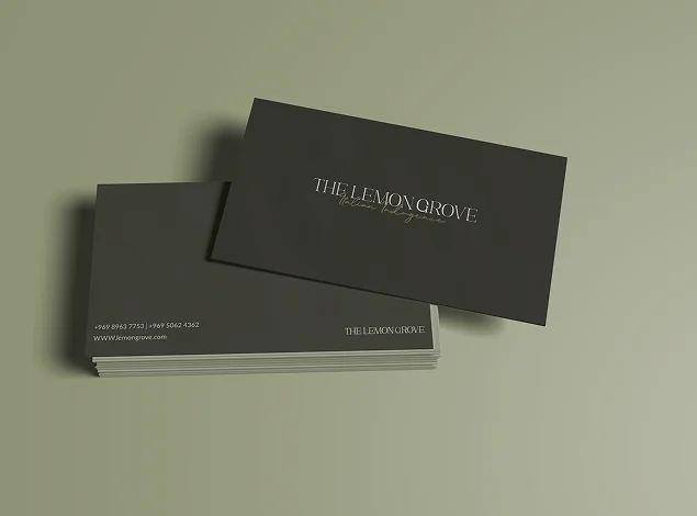
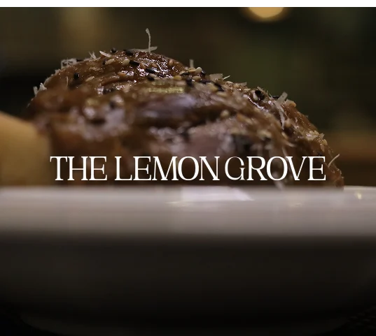
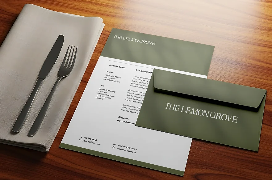
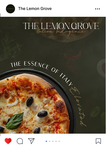
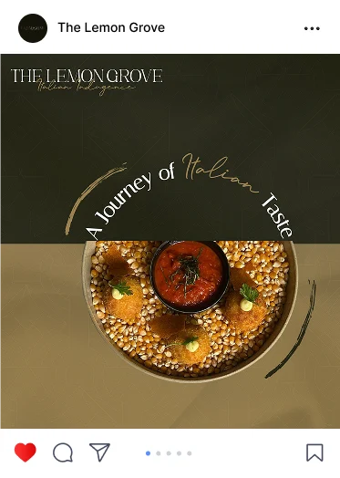
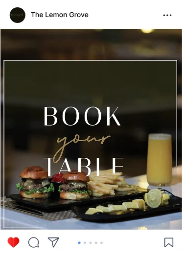
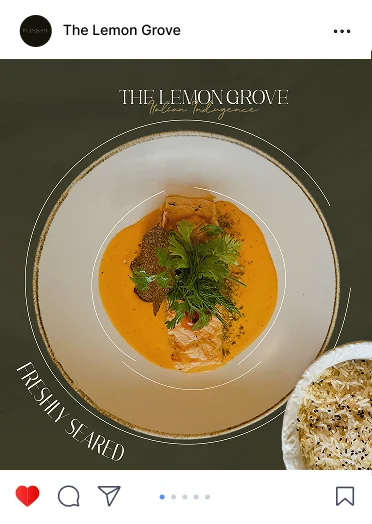
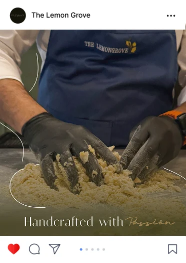
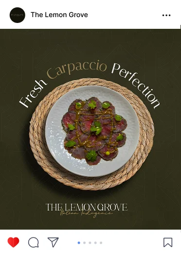
The system was carried onto the brass hanging sign, business cards, letterhead and envelopes, and into a social feed that frames each dish on deep green with the brand's script: Book Your Table, Freshly Seared, Handcrafted with Passion.
04
The Result
From a dining room
to a recognisable brand.
The Lemon Grove now carries one warm, confident identity from the sign at the door to the post on a guest's feed: a serif wordmark with its Italian Indulgence script, a palette drawn from leaf, grain and sage, and a social voice that sells the table before the menu is opened.