01
Brief
An identity built
like an interior.
AMK is an interior design studio working across residential and commercial spaces. It came to KHP needing a brand that could stand next to the quality of its own projects: a mark, a palette and a set of applications that a client would recognise before they had seen a single room.
02
The Challenge
Distinct in a field
of quiet logos.
Interior design studios tend to reach for the same thin serif and the same beige, and end up interchangeable. AMK needed a mark with a character of its own that still felt calm and architectural, never decorative.
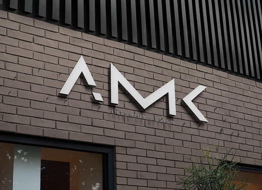
It also had to work at every scale the studio operates on: cut in metal on a façade, printed on a card, set over photography of its own materials. One system, legible on all of them.
03
Our Approach
Line first,
then material.
Step 01 - Mark & Typography
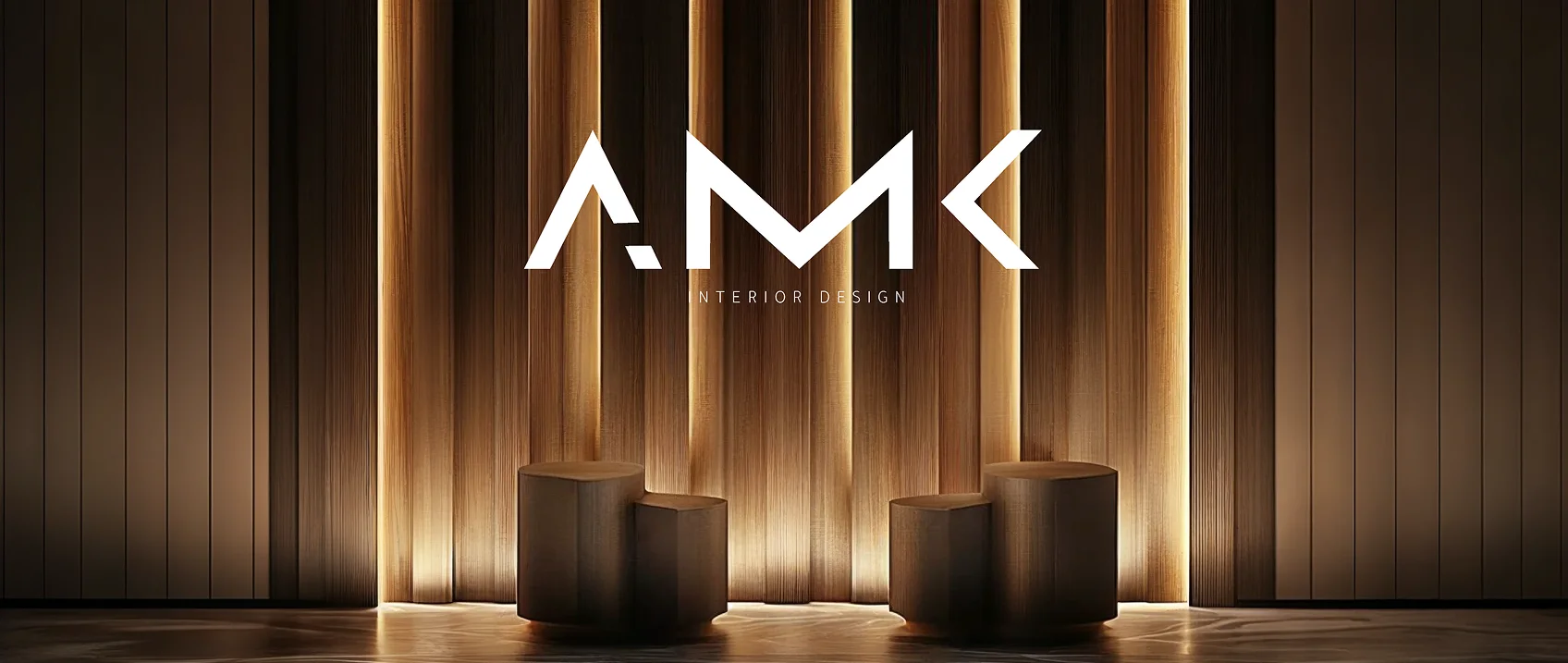
We drew the AMK monogram from straight cuts and angles, the language of joinery and section drawings, and set it over a widely spaced INTERIOR DESIGN line. The A's detached corner became a symbol of its own, used on its own wherever the full mark is too much.
Step 02 - Colour Palette
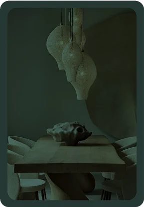
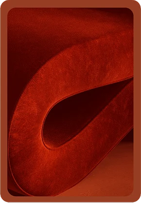
The palette comes from the materials the studio works with: Deep Green #263834, Blush Sand #DACABF, Terracotta #963E23 and Taupe #8C7D76. Two carry imagery, two stay flat, so the brand can move between photography and pure colour.
Step 03 - Applied Identity
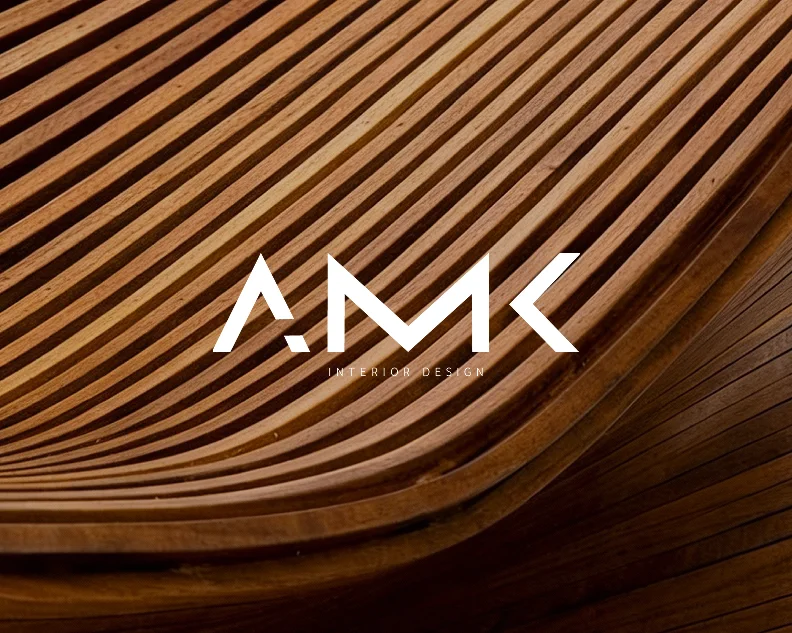
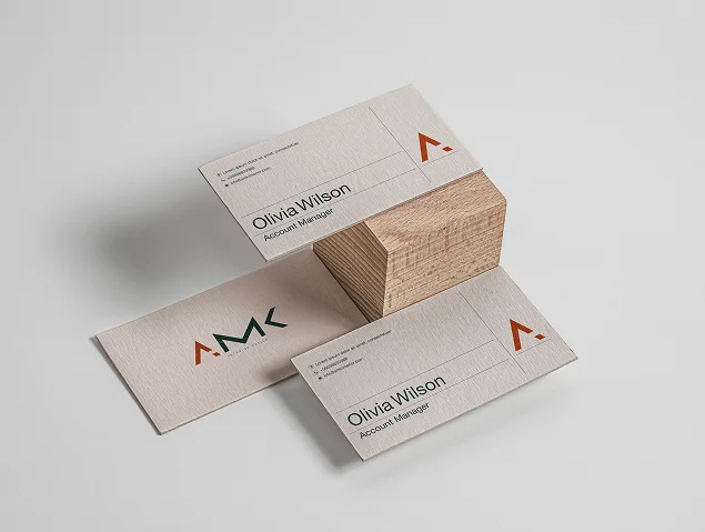
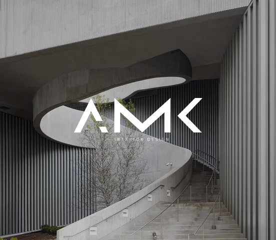
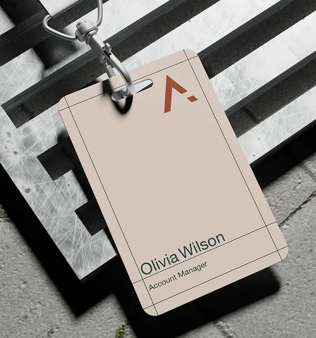
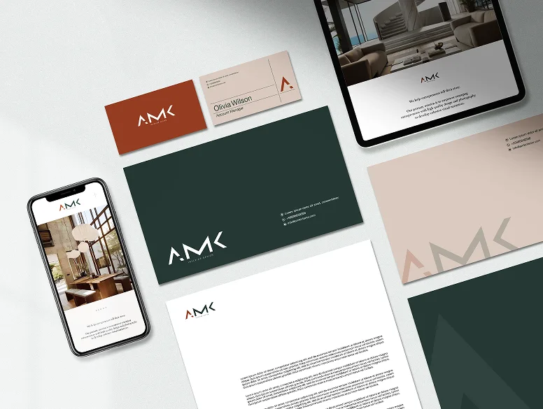
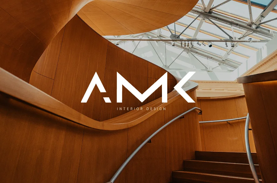
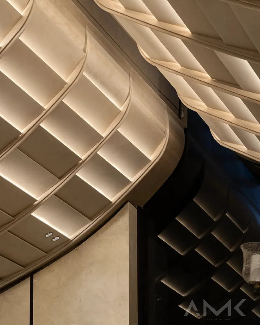
The system was carried onto signage, business cards, a staff badge, letterheads and envelopes, and a series of brand visuals that set the mark over timber, concrete and lit plaster, so the identity and the studio's own spaces read as one.
04
The Result
From a name to
a recognisable studio.
AMK now presents itself with the same precision it brings to a space: one angular mark that holds on a brick façade, a business card and a lanyard alike, a four-colour palette drawn from timber, plaster and clay, and a set of applications that make every touchpoint read as the work of one studio.